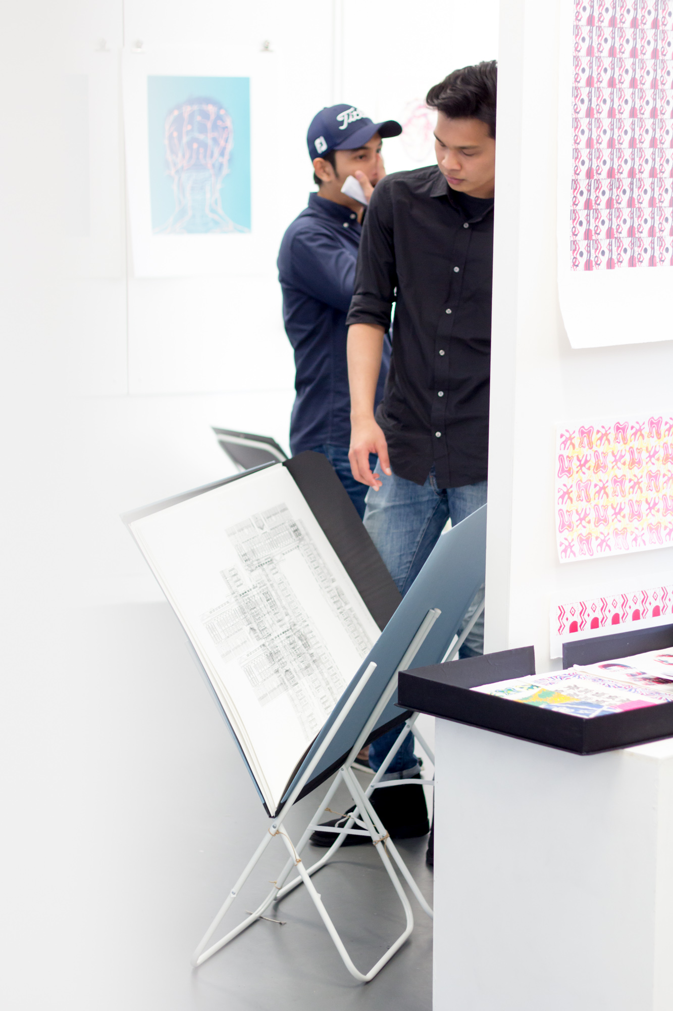
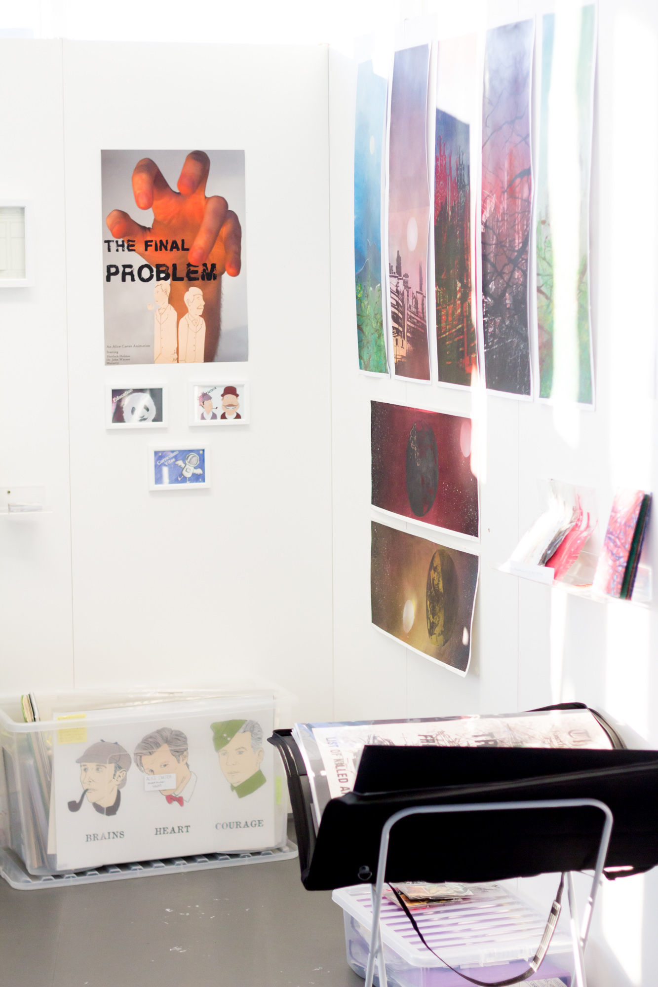
Our final part of our review of this year’s University of Portsmouth CCi Graduate Show focuses on the exhibition of the work of Illustration graduates. As always, this exhibition is a hot house (literally as the top floor always seems very warm each year) of creative talent, pushing Illustration in lots of intriguing directions. Each graduate had a wall space and packed it with prints, designs, 3D objects, cards, toys, portfolios and much more. Another great reason for visiting each year is to pick up some artwork at the Illustration course stall where they sell work by many of the graduates.
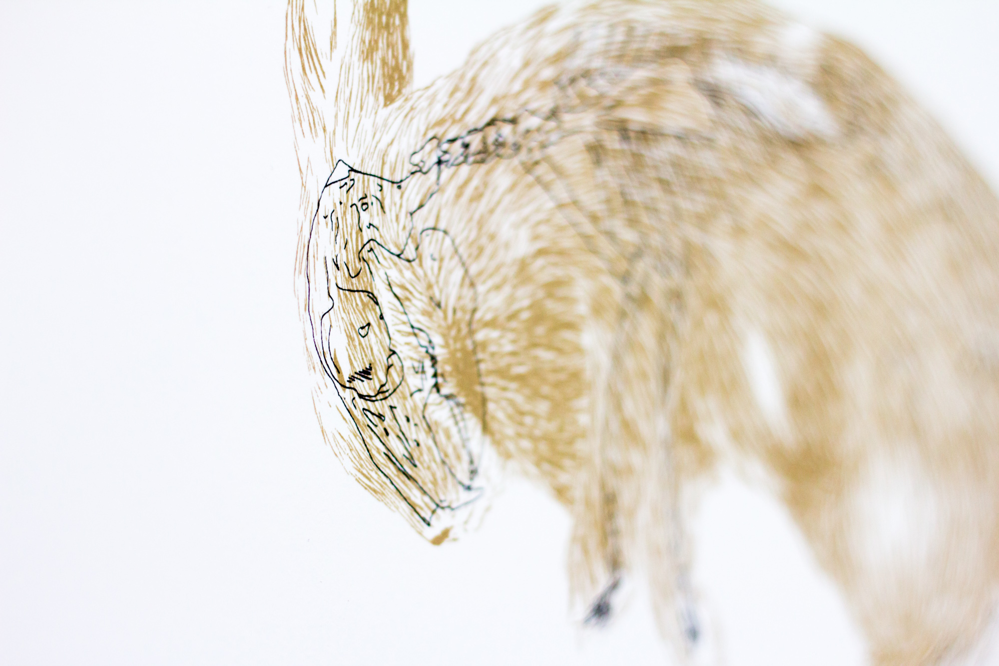
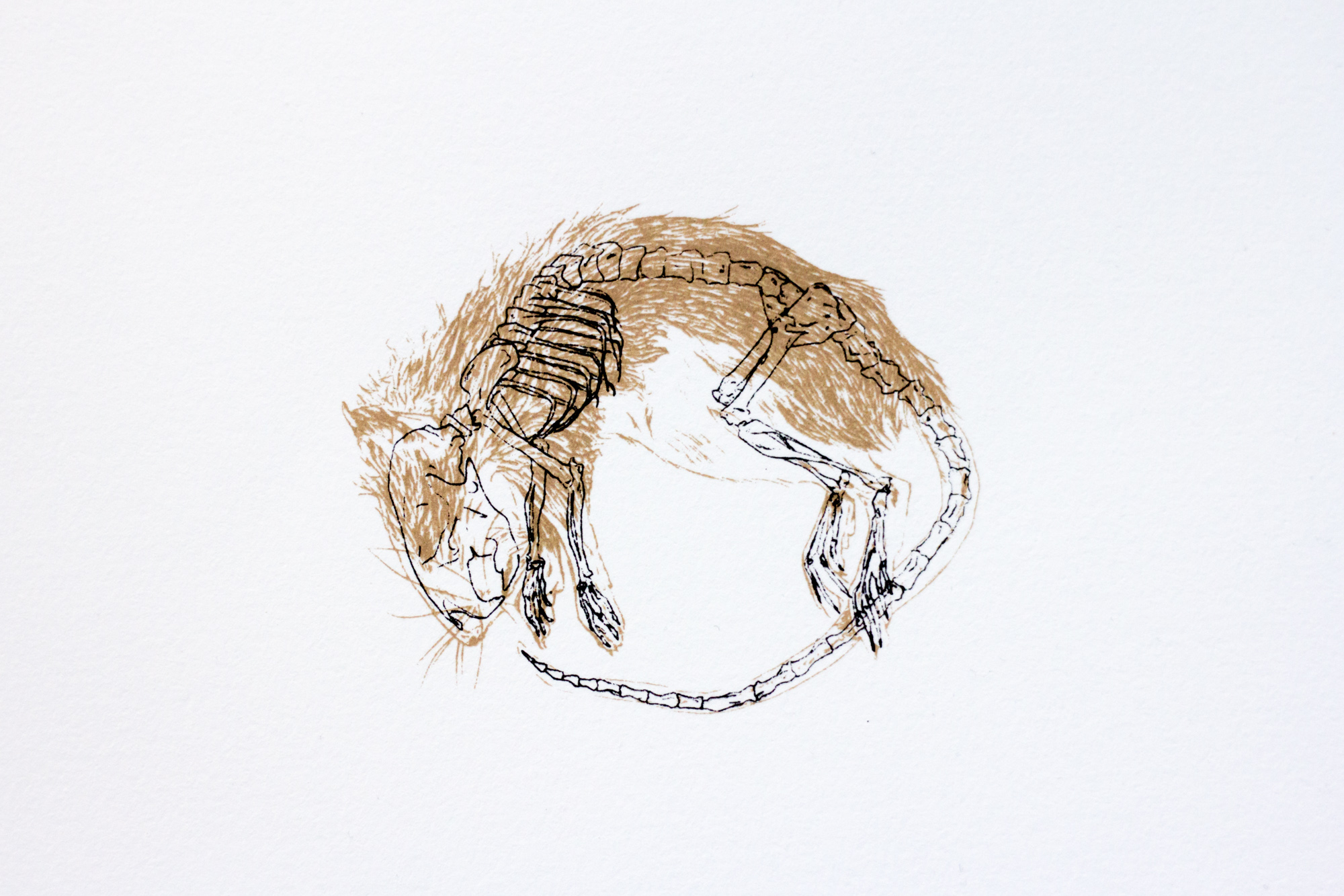
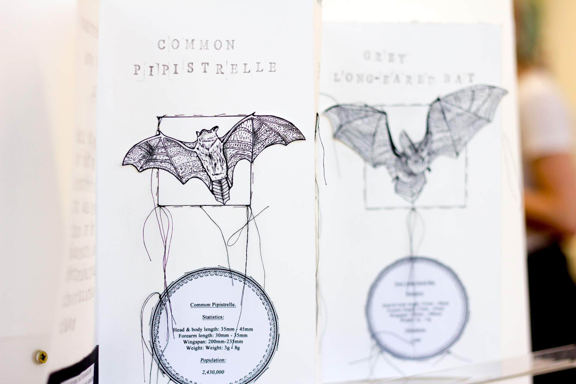
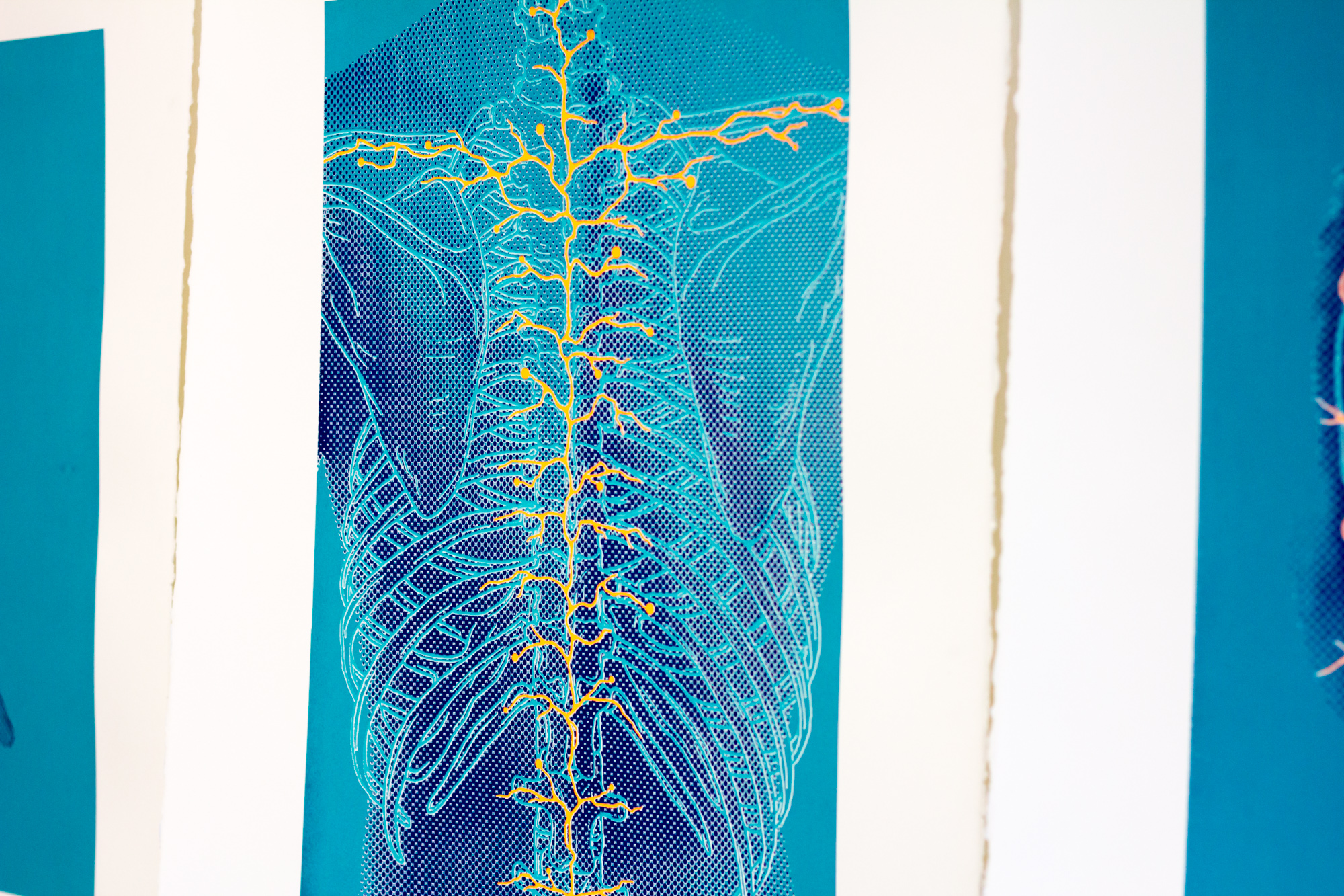
It is nigh on impossible to go through all of the work on show in the Illustration exhibition so this review is going to scratch the surface…but that is all the more reason why you should make this course a must visit each year. So after a walk around and a good look through the different levels and style of work the first person’s artwork to catch my eye was Paige Alexis Jones. The key items of Paige’s exhibition space were a selection of intricate illustrations of creatures, revealing their inner skeletal forms.
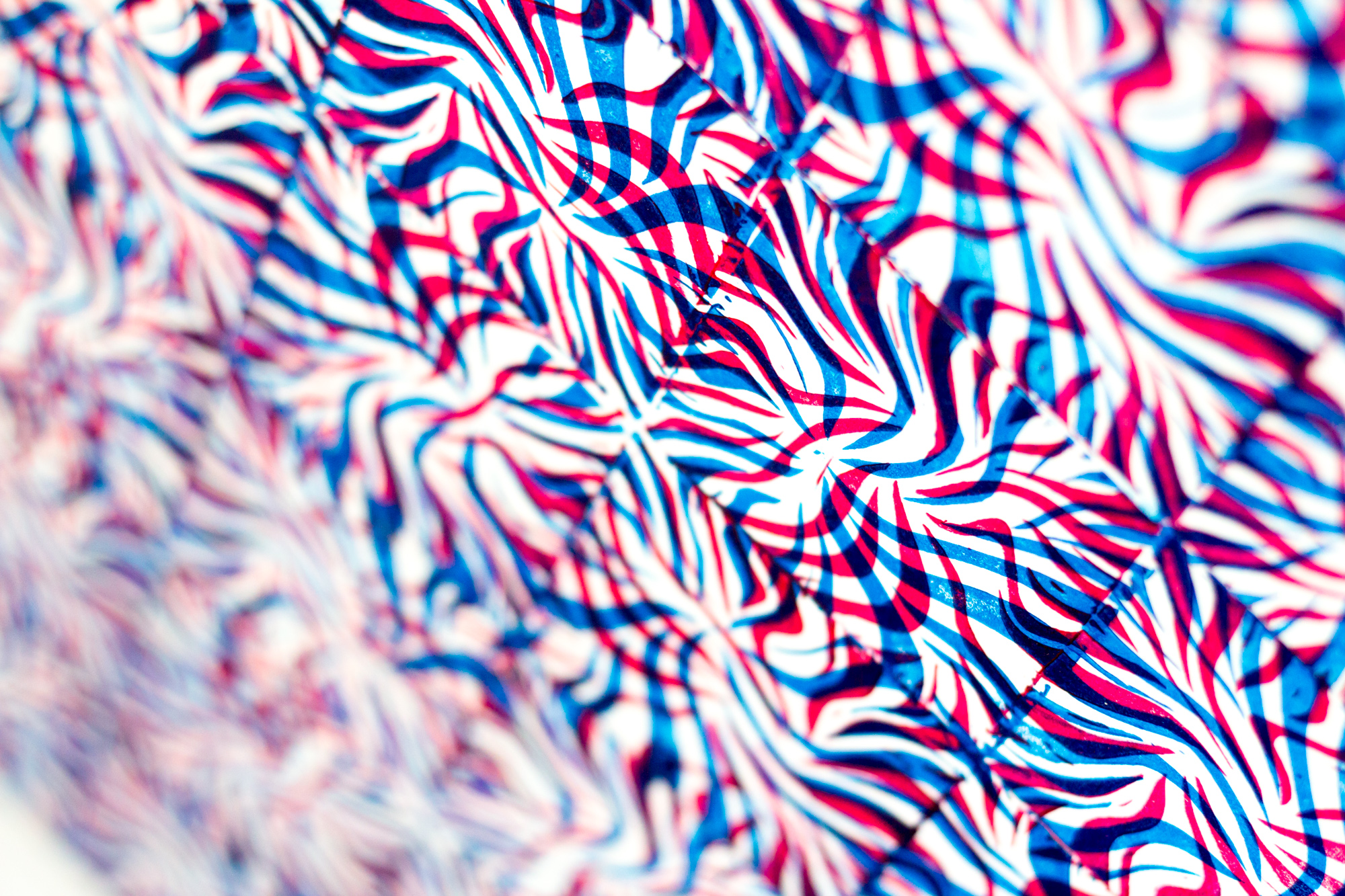
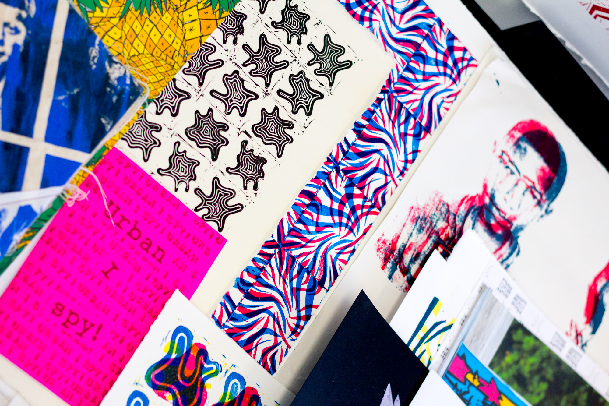
I really liked the screen printed work by Meredith Phipps, layered colours of portaits and patterns taken from nature, all drawing you in.
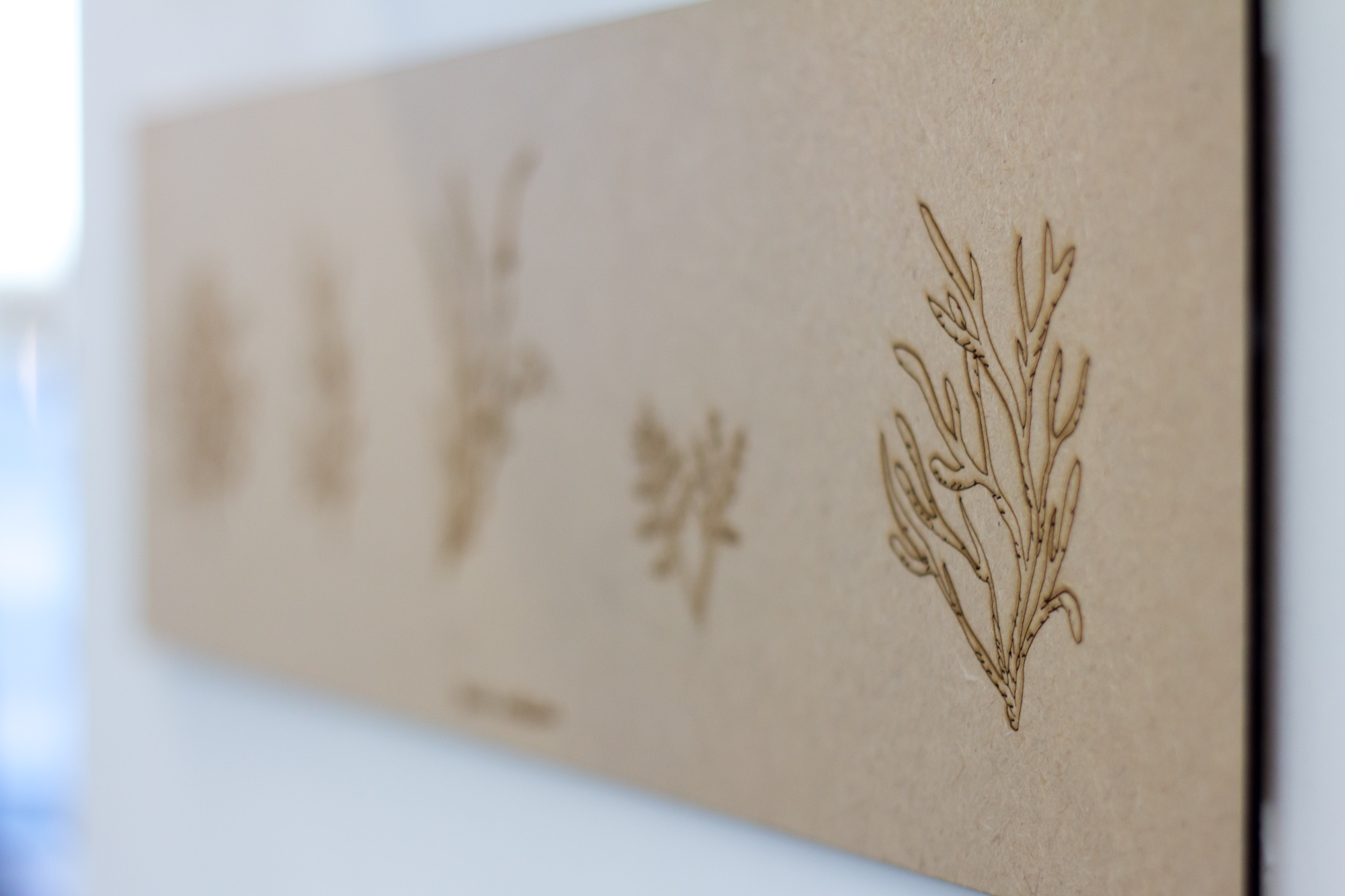
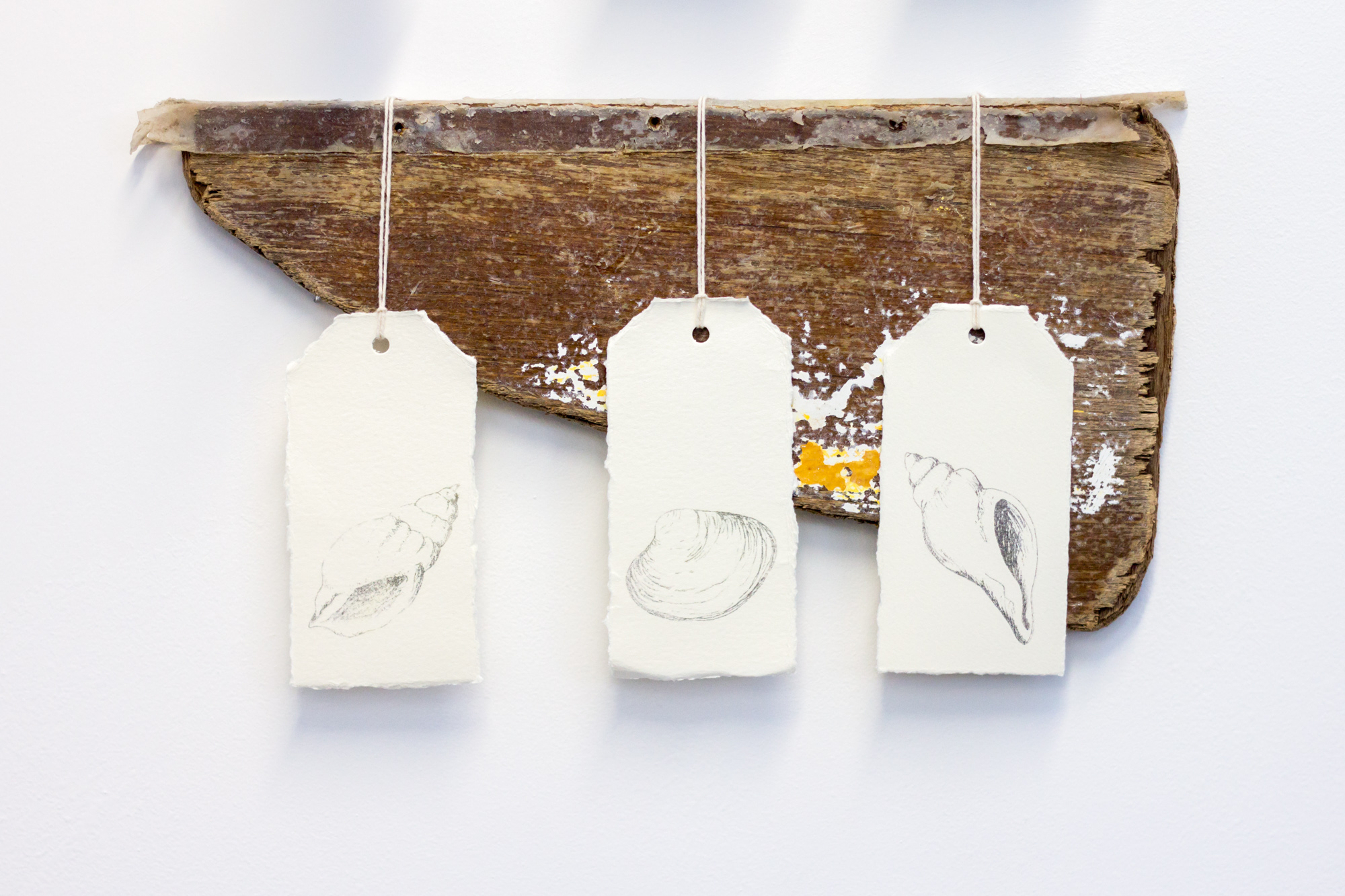
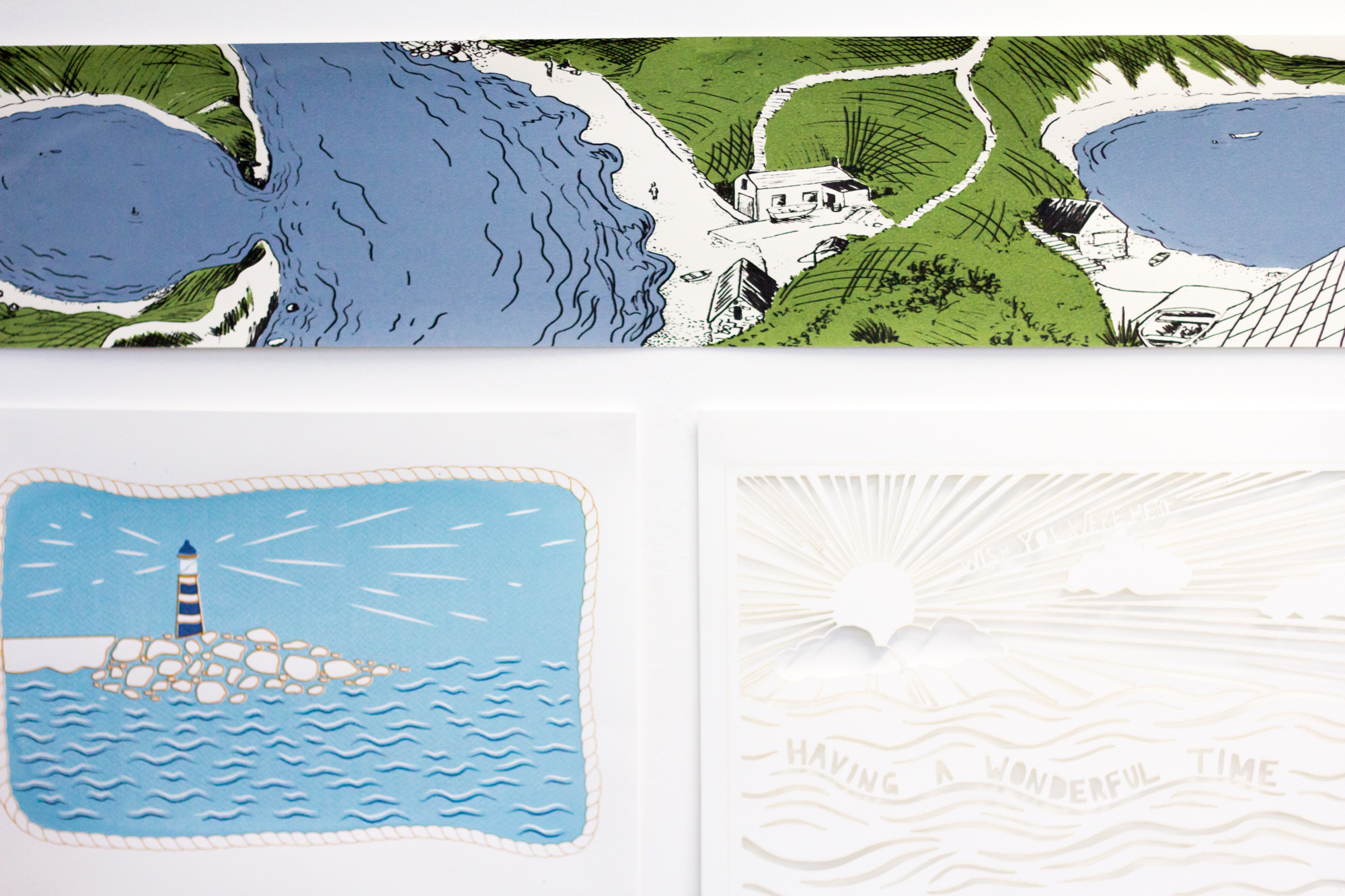
Karen Treleaven had a real mix of work on show all seemingly with inspirations from the shoreline and coast: from laser etched natural forms, use of wood and weathered materials plus clean, airy illustrations of the sea.
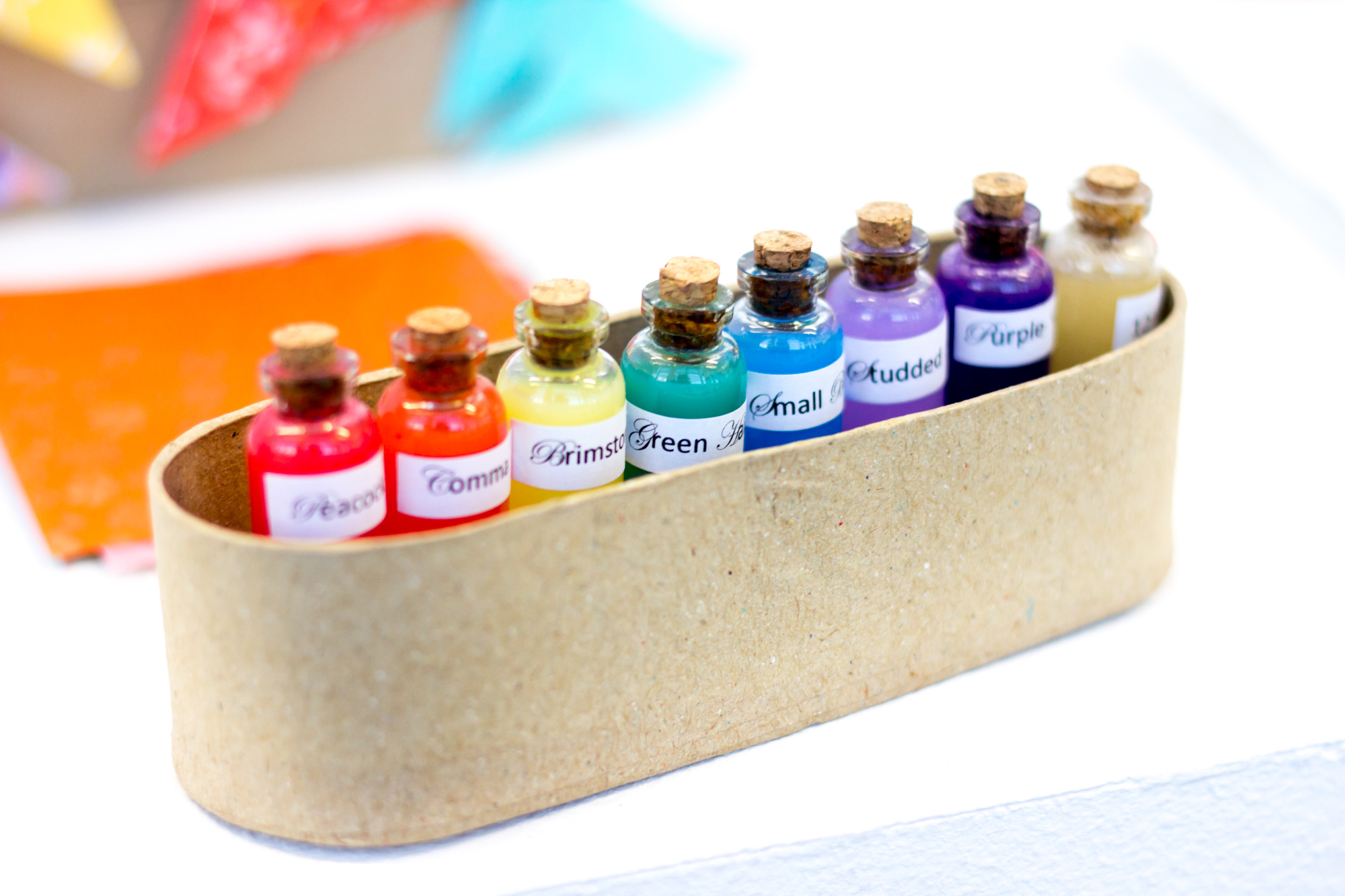
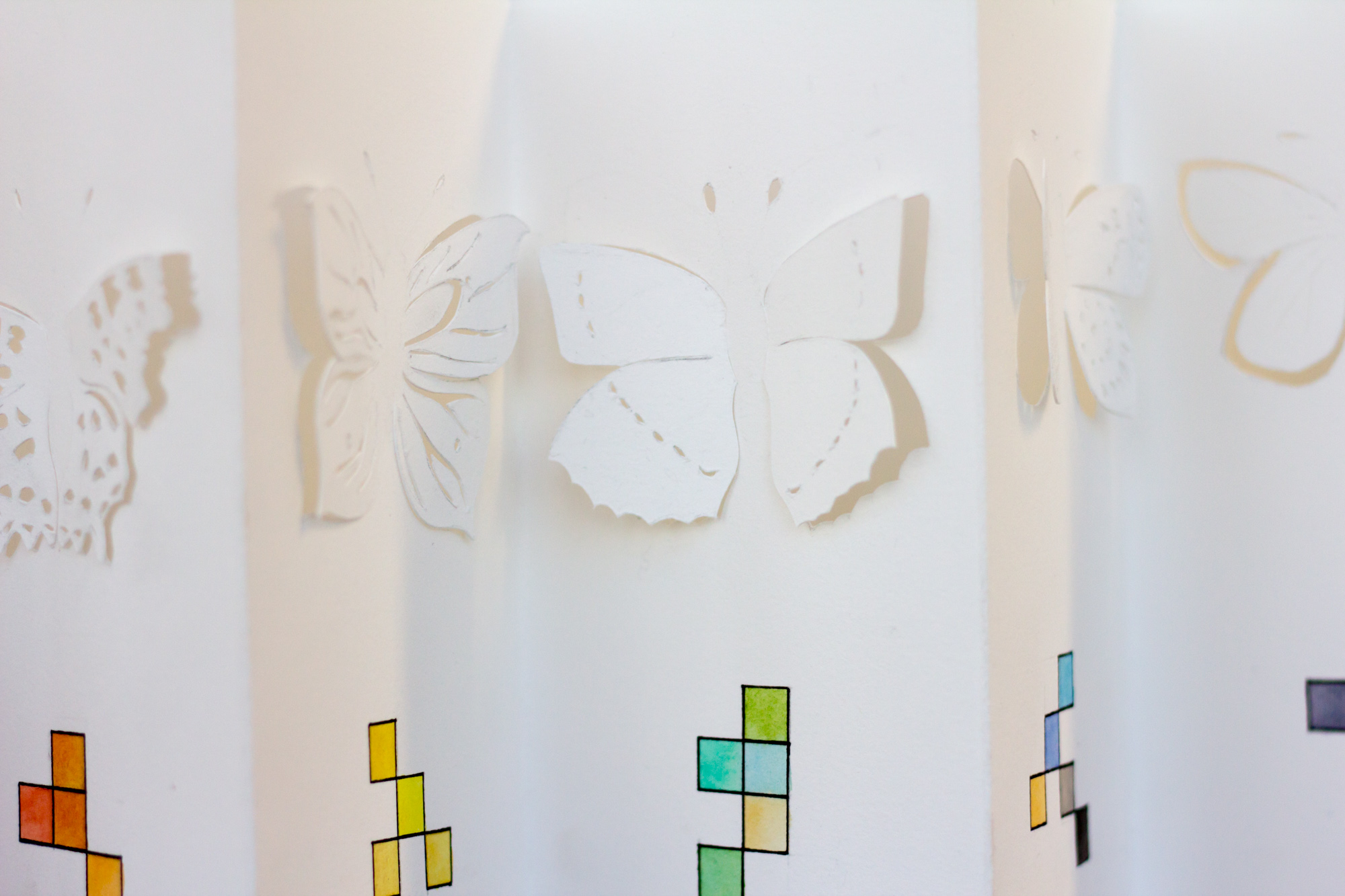
Continuing the inspiration from nature, Amber-Jane Hudson-Peacock pulled together work with a feel of scientifically analysing and extracting the colour from different creatures.
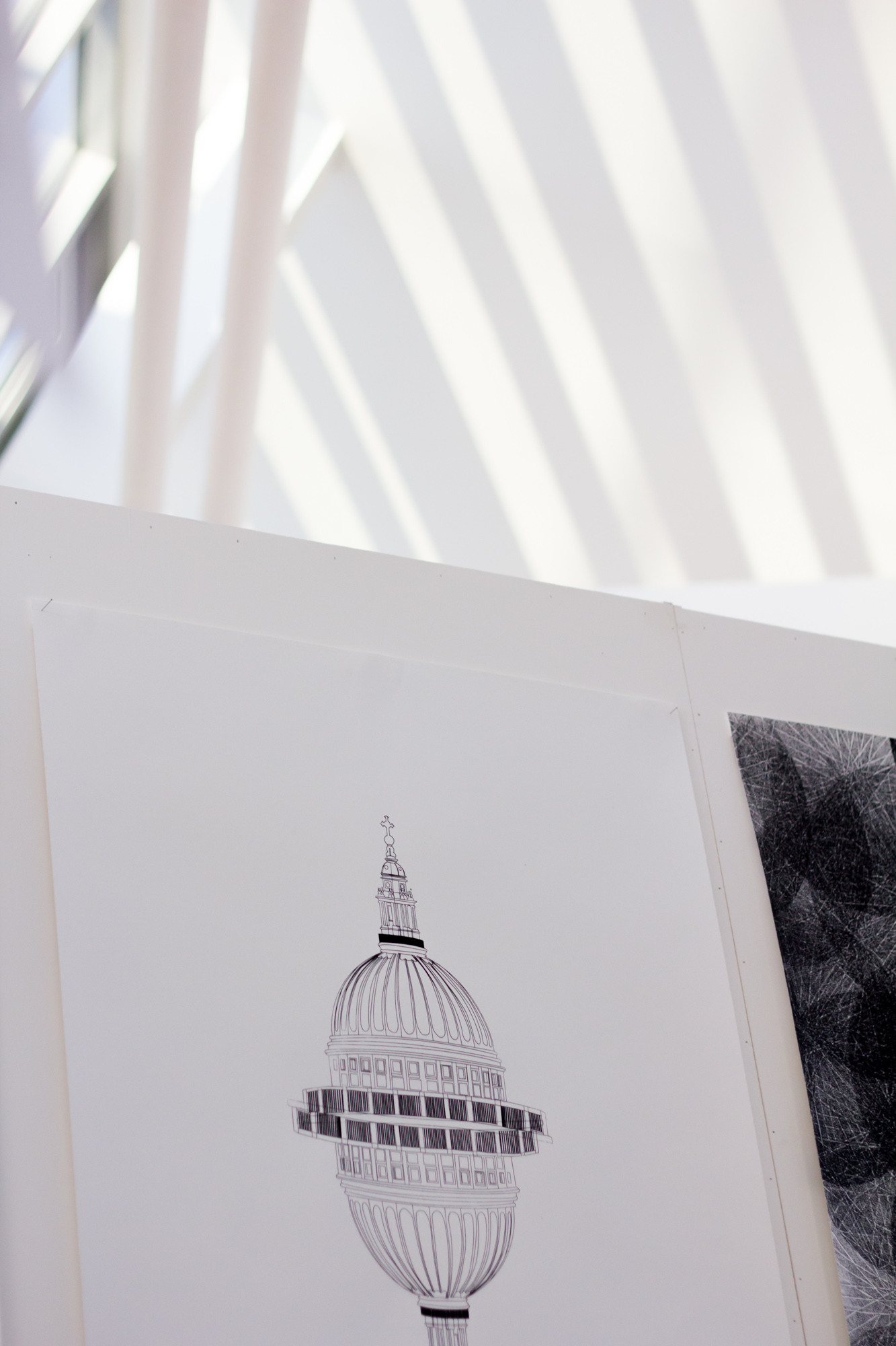
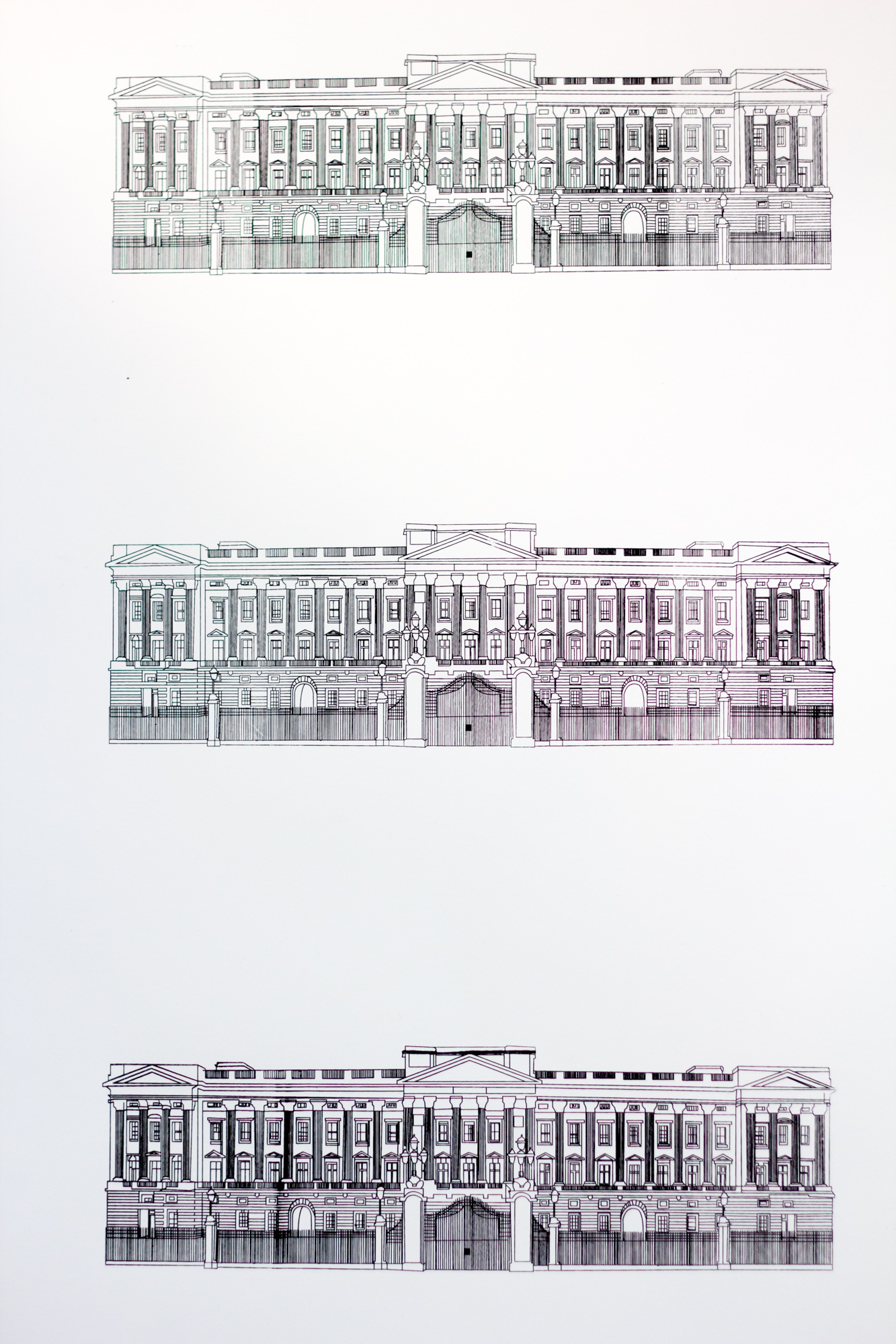
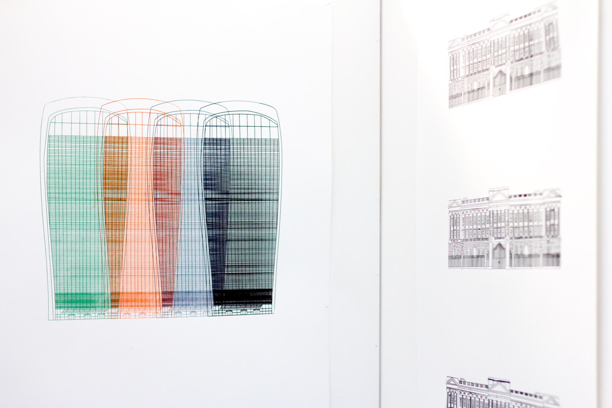
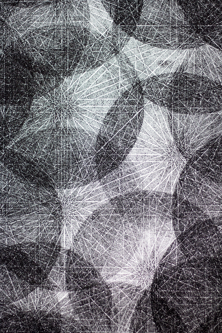
One of my personal favourites from the exhibition were the clean architectural structures and meshes by Aline Dovlatyarian. Through the different prints on show you could see London landmarks stripped back to their base structure, using hand drawn lines and software to construct beautiful hybrid cityscapes. Other work had a sense of classical architectural design drawings. Something about the London landmark print really caught my eye, so much so I bought an A1 print of the work. Would love to see a Portsmouth inspired version.
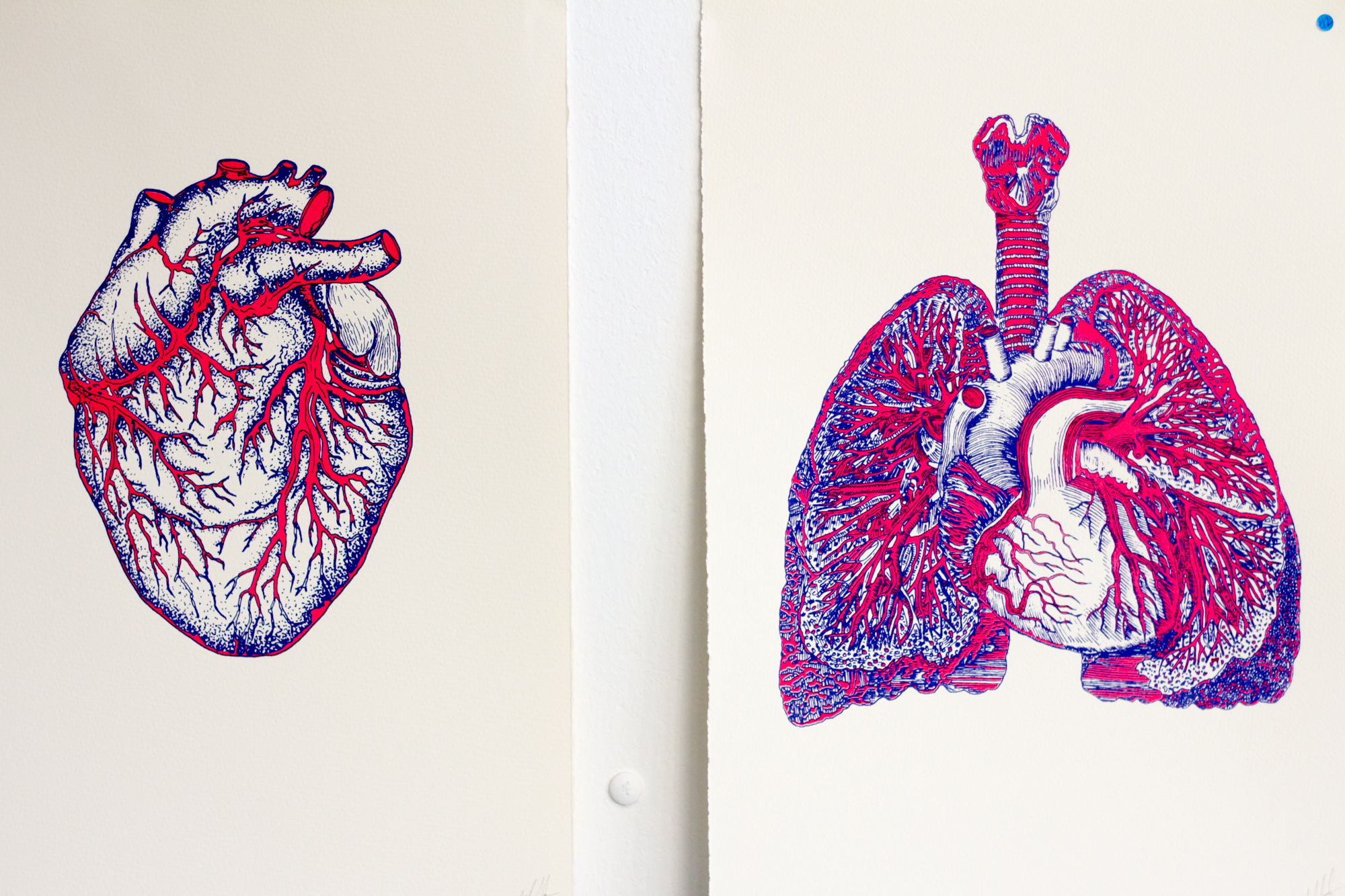
Next up was the boundary breaking print work of Dale Silvester. It has been great to see Dale’s work develop over the last year and I really liked the prints that only functioned with human interaction, these pieces used cutting edge inks and paints for screen printing. The lung print changing colour with human breath, the heart print changing colour from the heat of the touch of a hand. These seemingly scientific, almost sterile and functional forms, come to life with colour when they come in contact. Dale even used some very special electrically conductive ink for one print, with the ‘circuit’ connected by human touch. With just enough of this special ink to have two tries to screen print this piece, it showed the dedication and skill required to turn an innovative idea in to practical reality.
Dale also won the Anglepoise competition run with graduate students where different ‘scrolls’ were created, each interpreting the iconic lamps in different ways. Dale’s showed a lamp’s perspective on a journey.

We’ll announce the final winner of a Strong Island Creative Graduates to Watch award, this one for Illustration, later this afternoon. Below you can see more photos from the show and you can see more over on our Flickr too as well as all the photos from the Graduate Show 2015.
Looking forward to next year’s graduate show already!


Strong Island Creative Graduates to Watch Award 2015 – Illustration Winner Oliver Tubb | Strong Island / Portsmouth & Southsea's No.1 Cultural Resource
17 June
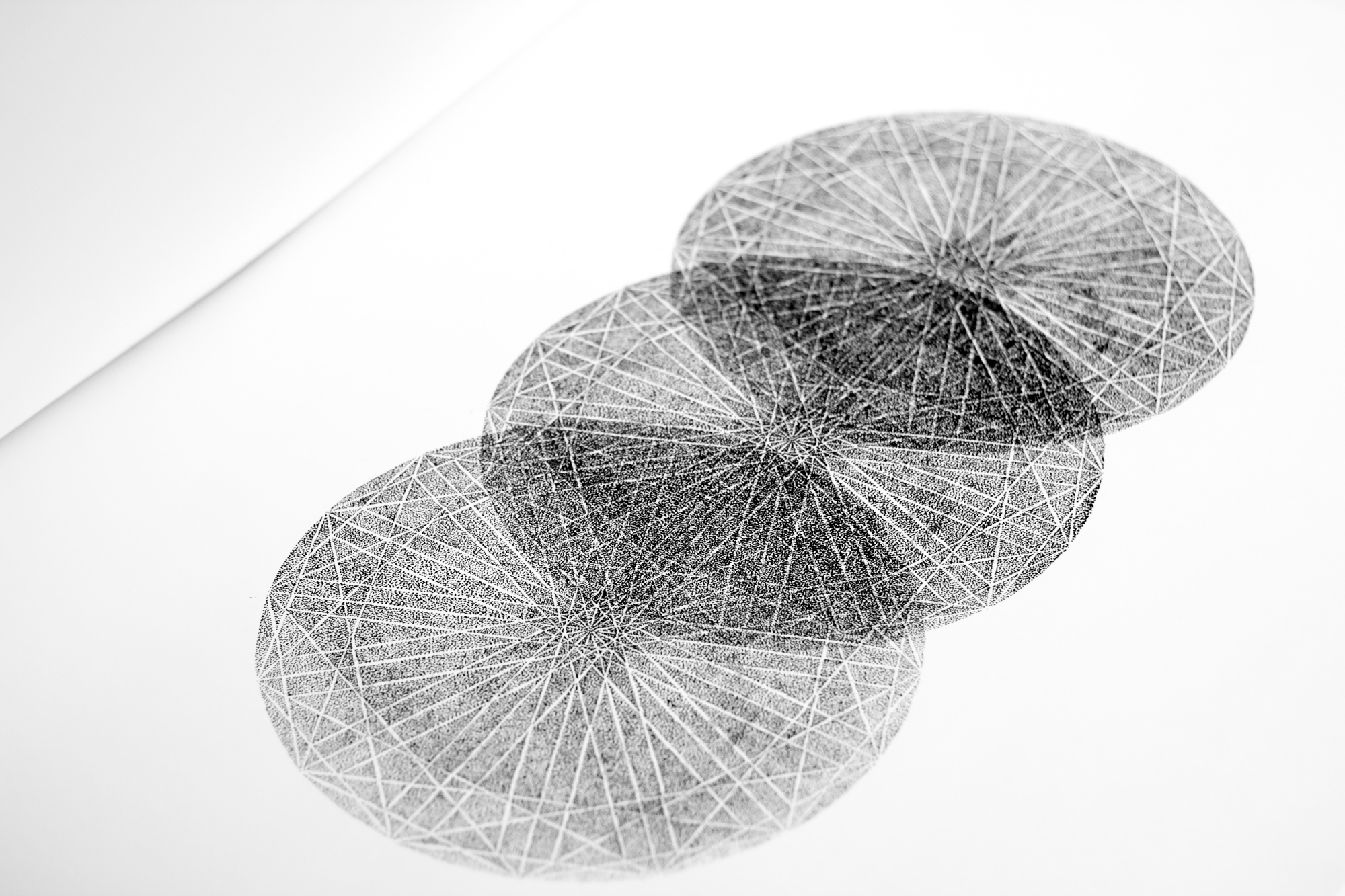
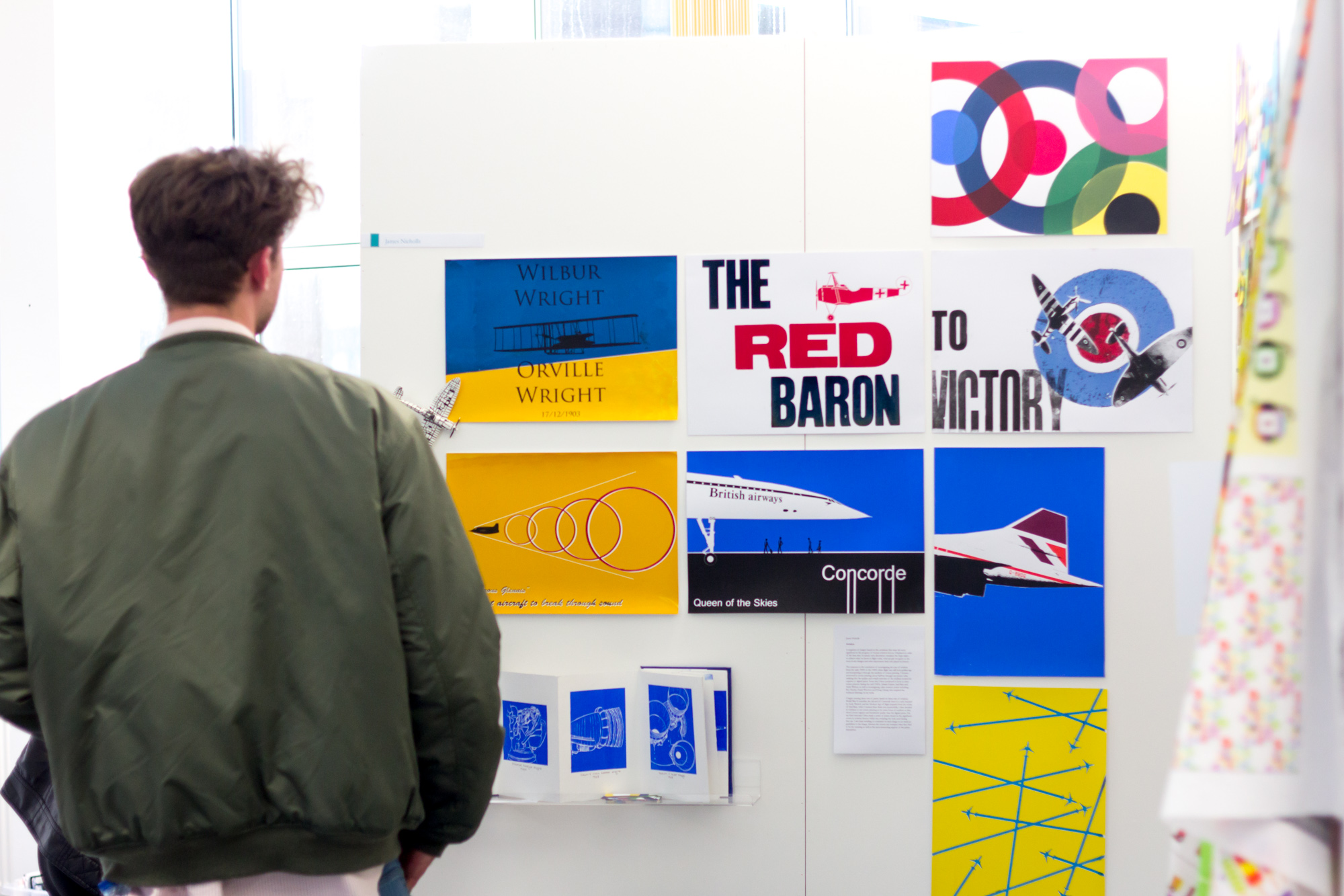
[…] you may have already guessed from the review of the Illustration exhibition that geometric patterns and forms hand screen printed always catch the eye. Oliver’s work […]