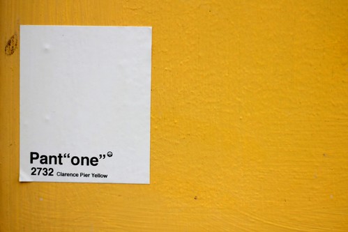
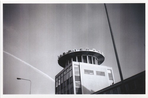
A lovely find this morning whilst down the seafront. A couple of stickers placed on Clarence Pier – Pant “one” – 2732 Clarence Pier Yellow. A blue version and a yellow (seen below).
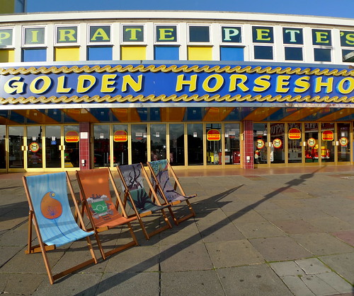
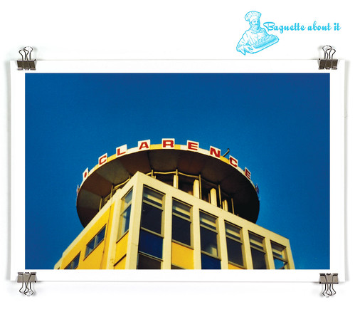
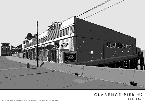
Over the years many people from around the city have used this iconic venue in their photographs and artwork.
It’s great to see this kind of creativity being used in this way. Anyone know the name of the artist? if so then please get in touch with us at Strong Island. Any more venues being used in this way?
Other examples include Sodavekt and Bored Collaboration, James Weaver, Tristan Savage, Matt Howarth and Claire Sambrook for the deckchairs project. Images below.


Dean
15 November
I feel a book coming on
Mike Cooter
15 November
‘Is there an app for that’? Or maybe a pocket big enough for an all-occasions swatch pad.
Ailbhe
16 November
Same thing seen at aspex during the summer – different labels for the dots in our logo.
claire sambrook
16 November
ah thanks for the info Ailbhe. Would love to know who is behind it.